• Cosmetic product swatches on a pastel pink background.
    Image from Pexels — cottonbro studio. Illustrative stock photograph.

    Beautiful packaging can make me stop scrolling, but it does not answer every question I have about a product. Sometimes, a close-up of its texture gives me something more useful to examine.

    A photograph of a cosmetic swatch shifts attention away from the bottle and toward the material itself. Shape, shine, and contrast become the main visual details. This creates a different story from a traditional product display.

    Still, an image has limits. Looking at a texture cannot tell me exactly how something feels, smells, or performs. That is where thoughtful written commentary can support the photograph.

    For me, effective beauty content combines attractive visuals with specific information. I want to understand what the creator observed and which parts reflect personal preference.

    This balance connects beauty with communication: the image attracts attention, while the explanation adds context.

    When exploring a new product, do you prefer packaging photographs, texture close-ups, or demonstrations?
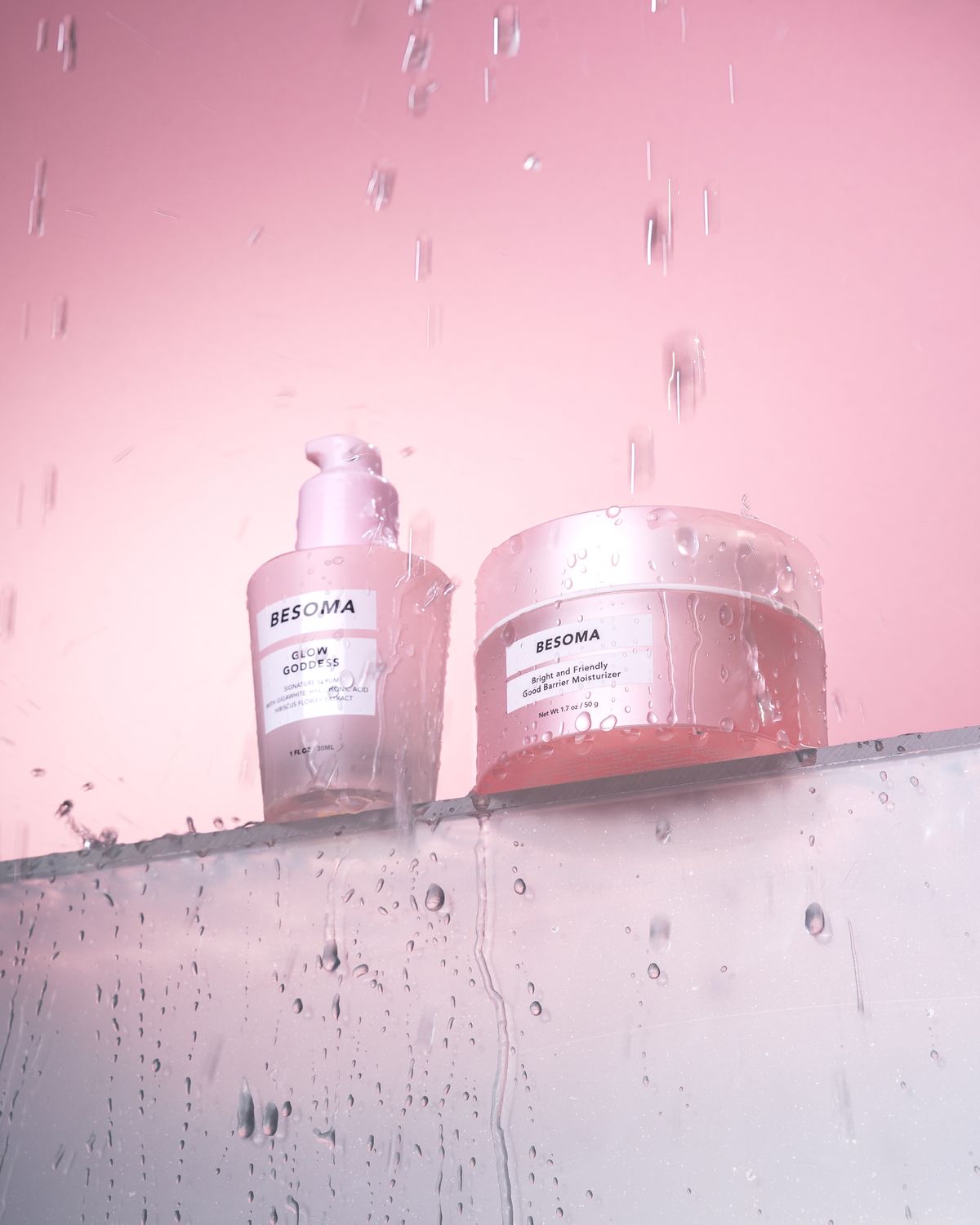
  • Skincare products displayed against a pink background.
    Image from Pexels — Moni Rathnak. Illustrative stock photograph.

    Before reading a caption, I often notice the colors in a beauty photograph. A pink background immediately creates a different visual experience for me than a black, white, or green one.

    In this product photograph, the background becomes part of the presentation rather than simply filling unused space. It connects the objects within one composition and gives the image a recognizable mood.

    Personally, I associate soft pink with a playful, gentle aesthetic. However, that interpretation is not universal. Someone else might connect the same color with a particular brand, memory, or cultural reference.

    This is why I find color choices so interesting in visual communication. Creators can suggest a mood, but audiences bring their own interpretations.

    For my own content, I prefer a limited palette that allows the main subject to remain easy to identify. A coordinated background can support the product without competing with it.

    Which colors would you choose for a beauty blog?

  • Assorted beauty products arranged on a pink background.
    Image from Pexels — Ray Piedra. Illustrative stock photograph.

    An arrangement of beauty products can turn everyday objects into a carefully composed image. Bottles, containers, and empty space become visual elements that guide the viewer’s attention.

    However, every photograph has boundaries. We see the objects inside the frame without necessarily seeing the room, equipment, or preparation surrounding them. That selection is an important part of how a visual story is constructed.

    A close crop can emphasize packaging or texture, while a wider composition can show relationships between several products. Neither approach automatically provides the complete picture. Each serves a different creative purpose.

    For me, recognizing these choices makes product photography more interesting. A polished image reflects decisions about what to include, where to place it, and what to leave outside the frame.

    When viewing beauty content, I want to appreciate the composition while remembering that the photograph presents one selected perspective.

    Do you enjoy seeing behind-the-scenes images alongside the finished photograph?

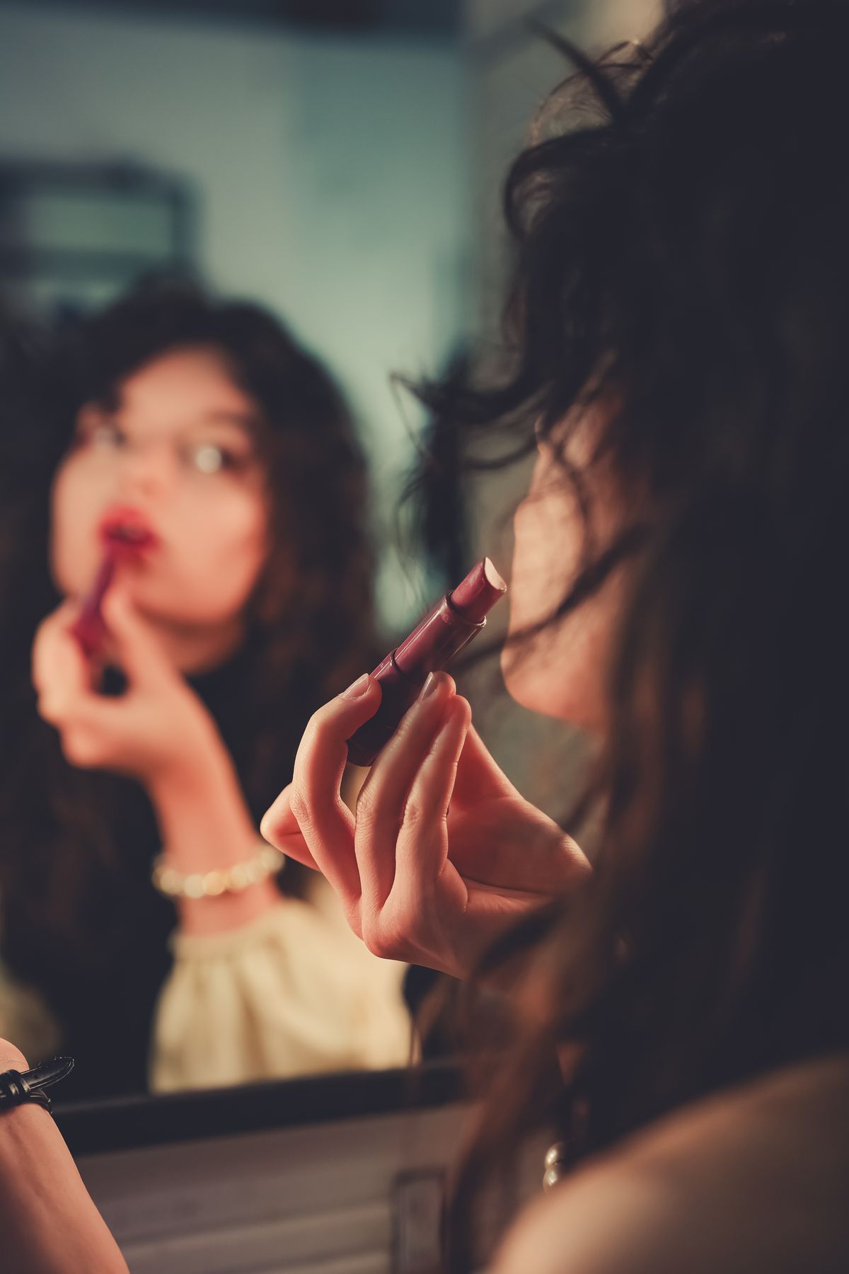
  • Woman applying lipstick while looking into a mirror.
    Image from Pexels — Enes Türkoğlu. Illustrative stock photograph.

    Lighting is one of the first things I notice in beauty content, even when I do not immediately realize it. The placement of light can influence which details attract attention and how the overall photograph feels.

    Soft light can create a gentle atmosphere, while stronger shadows can make a portrait feel dramatic. These choices are part of visual storytelling. They guide our attention toward certain features and influence our impression of the scene.

    As someone interested in beauty and communication, I think this is important to remember while scrolling through social media. A photograph captures a person under particular conditions, rather than showing every version of their appearance.

    Understanding lighting helps me appreciate the creativity behind beauty photography while being more thoughtful about comparisons. Before wishing I looked exactly like an online image, I want to consider how that image was made.

    What lighting makes you feel most comfortable in photographs?

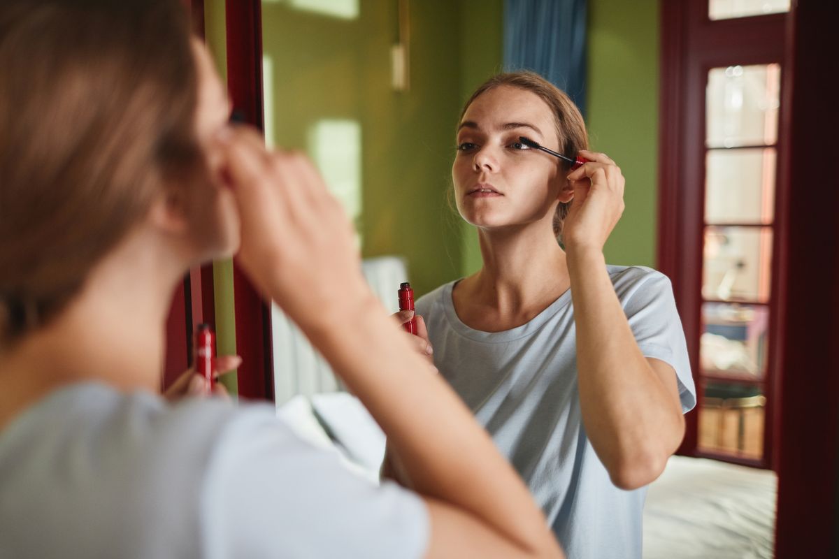
  • Woman applying mascara in front of a mirror.
    Image from Pexels — Marcus Aurelius. Illustrative stock photograph.

    Beauty content often focuses on the final reveal: the finished makeup, styled hair, or carefully arranged outfit. However, photographs of the process can tell a different and equally interesting story.

    An image of someone applying makeup directs attention toward an action rather than only an outcome. The mirror, tools, and gestures provide context about the routine. These details can make the scene feel more familiar to viewers who recognize similar moments in their own lives.

    I enjoy this approach because beauty is also a creative activity. Choosing a color, adjusting a technique, or taking time to get ready can be part of the experience worth showing.

    As a content creator, I want to remember that a finished look is only one possible subject. The preparation can offer useful information and opportunities for connection.

    Would you rather watch a complete beauty routine or a short video showing only the final result?